Zesty
Ensure your device is at full screen brightness for most accurate colour rendition.
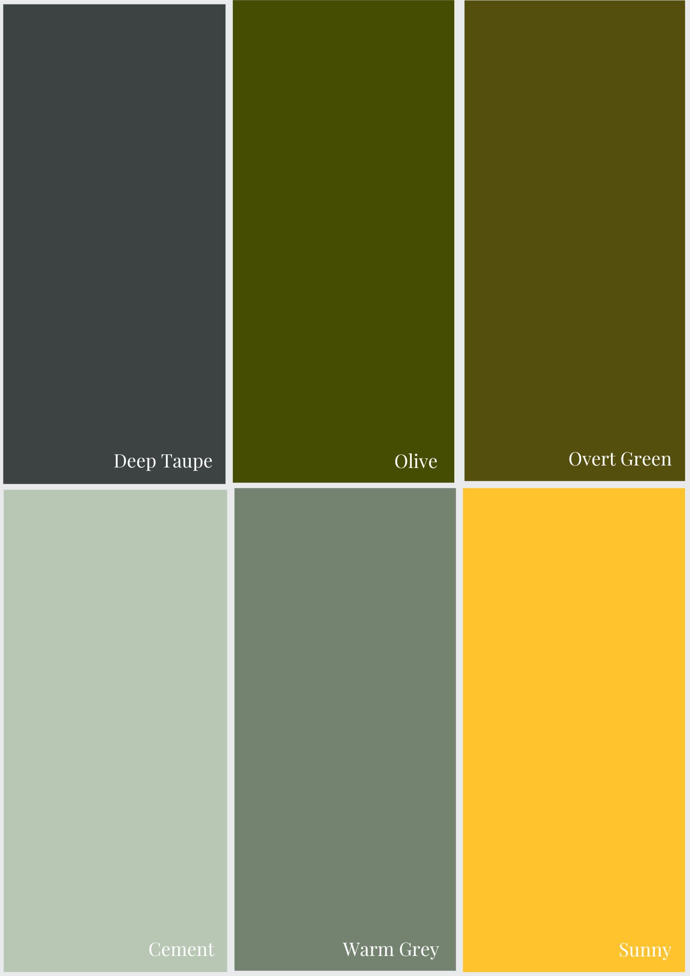
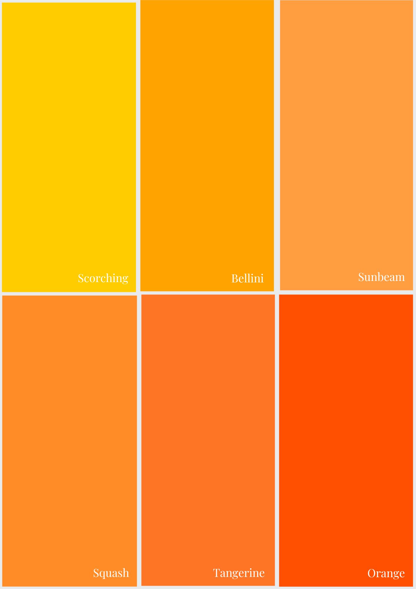
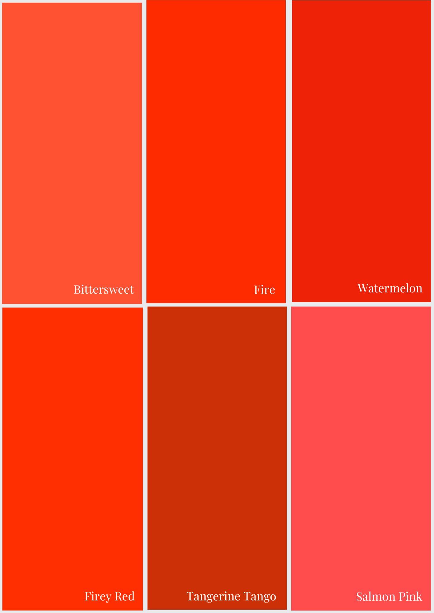
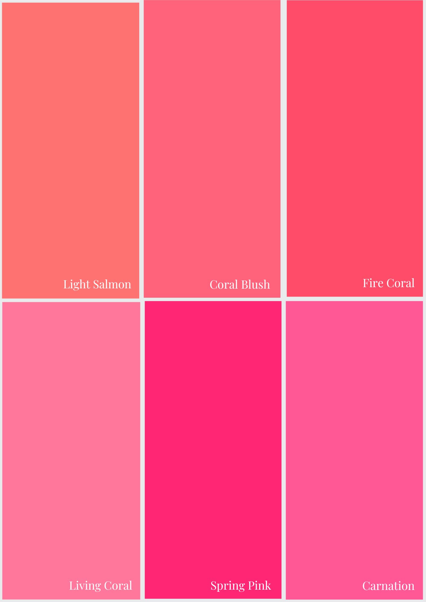
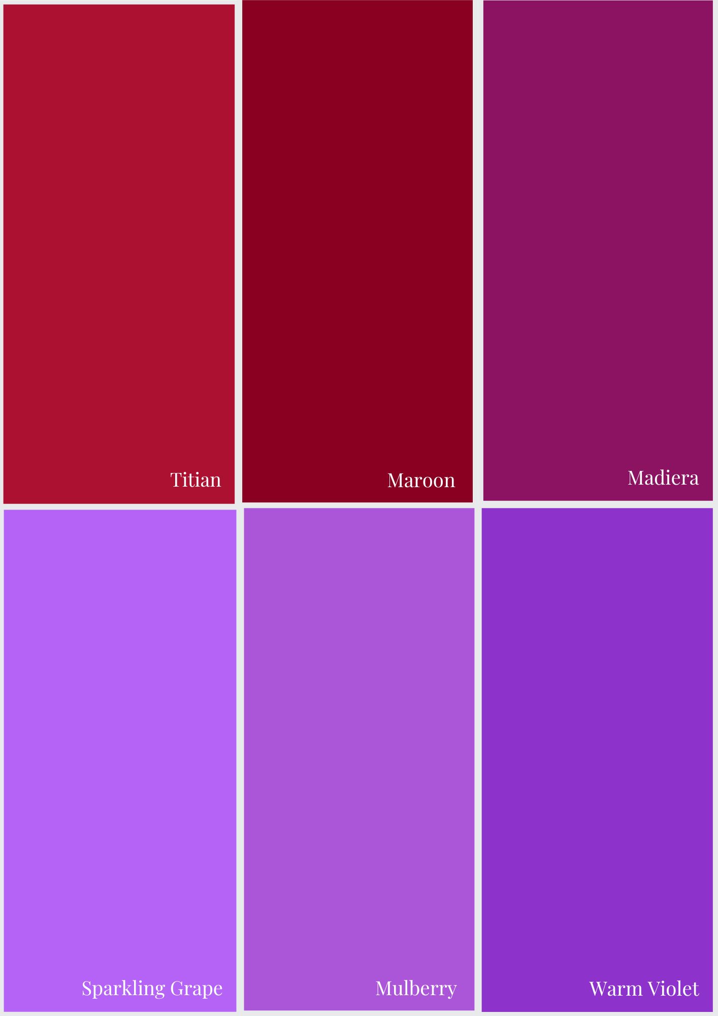
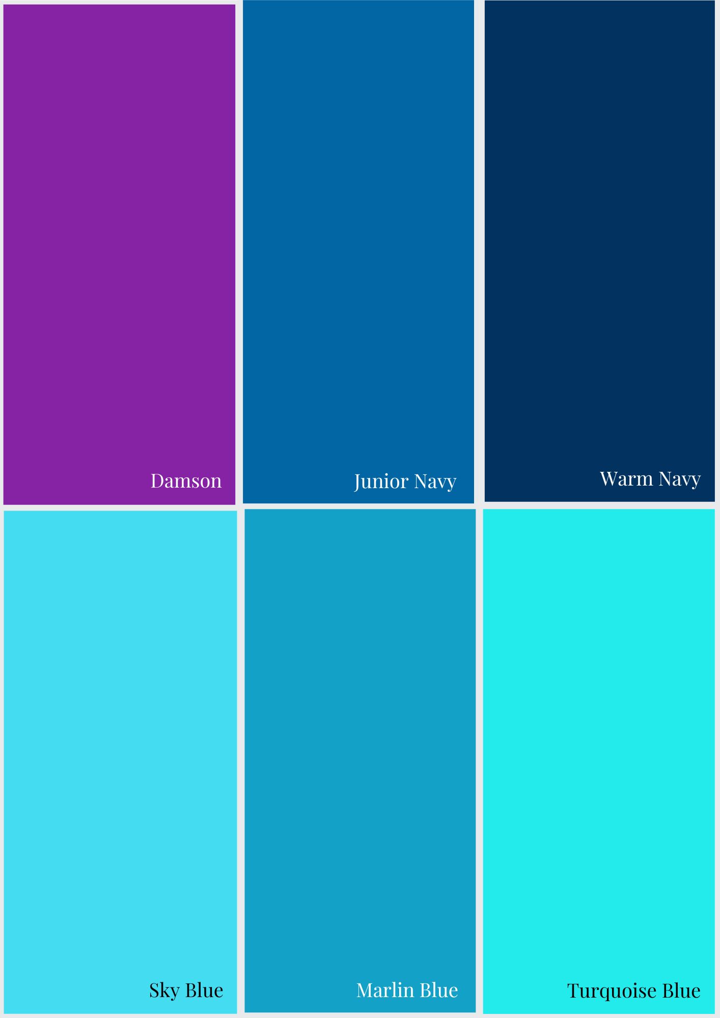
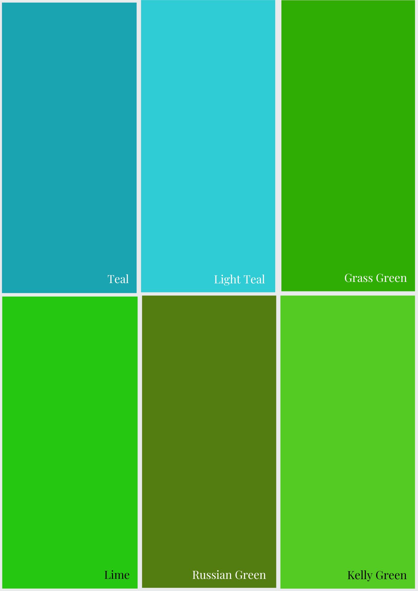
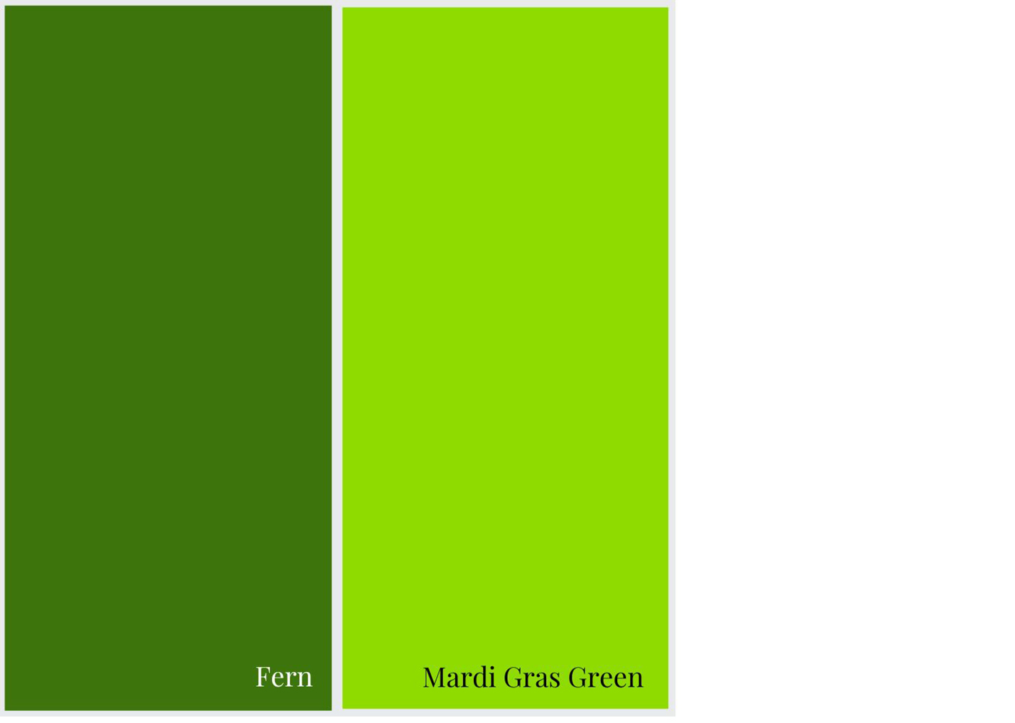
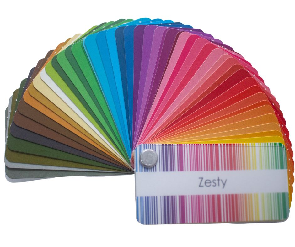
How to Use Your Personal Colour Analysis Colour Swatch
Remember, it’s a tool of around 50 colours to help you find the 50 000 that suit you! Don’t get obsessed with matching each colour exactly.
Please don’t limit yourself to just the colours in the swatch you have. You will be cutting off so many possible colours. All you’re looking for is the feeling that the colour blends, that the colour could be in the swatch, but it’s been left out.
Any colour that will work for you needs to have a similar intensity, undertone and value. It should feel like family to the other colours in the swatch.
So if you’re looking at a green – does the green look like it fits within your green spectrum? Or is it a very different sort of green? So if you had a cool palette, if you were looking at an emerald green and it has the same intensity, it would most likely fit. But if you were looking at an olive green, even if it had the same intensity it would not fit as the yellow undertone of an olive green would make it too warm.
Always remember to fan out the swatch as a whole, look at all the colours with the colour you are comparing to, not just individual colours, this way you’ll get the best result and a truly mix and match wardrobe as the colours will work beautifully together.
Remember, your colouring changes as you age, so getting an updated colour analysis every 5-10 years is a worthwhile investment as it will keep you looking fabulous.

How to Choose a Patterned Garment with Flattering Colours
3 Tips on Choosing Patterns to Match Your Swatch
- Fan out your colour palette and make sure the pattern blends as a whole (don’t just look for individual colours, remember your swatch is a representation of the vast number of colours you can wear well that flatter).
- Hold up the swatch to your patterned fabric and see if it feels like it blends or sinks into the fabric (this is what you’re after) or stands off the fabric (then it’s not right).
- Make sure any colours that don’t blend your swatch are less than 10% of the overall combination
When choosing prints and patterns to go with your colours swatch you need to match the colour properties of the colours. This includes the intensity, undertone and value of the swatch with the print or pattern.
Intensity – how bright or smoky the colour is – you want to choose colours in a similar intensity to your palette – this way it’s easy to mix colours in your wardrobe.
Undertone – how warm or cool the colour is.
Value – how light or dark the colour is – if you have dark hair, your swatch will be overall darker, and if you have light hair, your palette will be overall lighter.
How to Choose Makeup Colours that Flatter
The first thing you want to think about when choosing makeup colours – from eyeshadow to blush, bronzer to lipstick, is will they flatter your complexion.
You will find that when a colour doesn’t suit you, the colour of the makeup is noticeable, whilst when it does flatter your colouring, you are noticeable and you just look like a more glamorous version of you, rather than someone wearing lots of makeup
Choosing Blush Colours
- Choose a blush colour that is not too dark and appears natural on the skin.
- Warm complexions need a soft peach, apricot or coral blush or can use a bronzer.
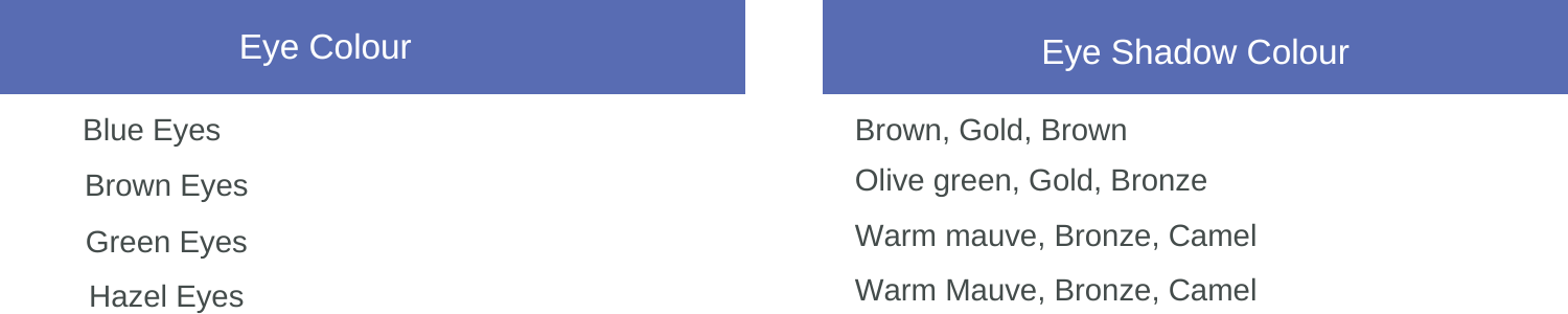
Choosing Eyeshadow Colours
Eye shadow should enhance the eye colour, rather than compete with it. Your eye intensifying colours are those that are either complimentary, split complementary colours (opposite or almost opposite on the colour wheel) or within the opposite side of a triad.